By Ben Langlotz
|
July 30, 2019
|
Marketing
|
0 Comments
KNOT GOOD MARKETING? How Well Does the Firearms Industry Do it?

Every Vacation Day Carry?
I’m a fan of good marketing. I loved Mad Men and I admire the fictional genius of Donald Draper. I’m probably not the only one who likes to play armchair ad-man now and then. Still, I admit it’s a lot easier to criticize after the fact than to create a good marketing campaign from scratch.
For example, a Facebook meme revealed that decades ago A&W root beer hamburger stands tried to compete with the McDonalds Quarter Pounder(tm). Proving that some things are more important that price and quality, they offered more (1/3 pound patties) for cheaper. And still failed. According to the meme, customers were so ignorant about fractions that they thought that 1/3 was smaller than 1/4. I’m not sure I believe it but it got me playing Don Draper and imagining his creative process:
Nobody weighs their burger. They just know they’re HUNGRY. We’re not selling fractions – we’re selling MORE. Let’s play on the confusion – our patties are a third bigger: ‘A third more beef?’ Nah, still confusing – feels like a boring grocery coupon no one trusts — all that matters is MORE. How about this: Three guys around the table, each just finishing up a burger. In the middle between them is a fourth burger. Quick-cut close-ups of their hungry eyes shifting from the burger to each other. Point-of-view shots zooming on the burger. Voice-over: ‘What would you do for MORE BEEF?’
Anyway, it’s fun to play “mad man,” and I’d hate to have to do it on a deadline. But it’s even better when I can sit back and admire my clients doing things right.
Details Details
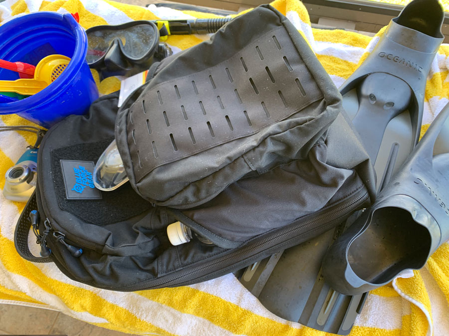
Sometimes product details are the foundation for good marketing. I usually get brought in when the question is “Can we patent this?” Recently I had the chance to notice for myself when a product has something special. I recently received a deceptively simple black backpack from my client Blue Force Gear. I don’t solicit freebies, and this isn’t meant to be a promotion. I think someone there wanted to say thank you for something I helped with and just sent it.
The first thing that surprised and impressed was that their main brand was removable. That’s pretty bold. Imagine if Nike made the swooshes removable from their shoes! Crazy? No, the cleverness is that the Blue Force gear brand is on a Velcro patch at the top of the back-panel. I’ve never removed mine, but now have a motivation to add other patches from my favorite clients (but please don’t send anything to the office PO box if you think that’s a shameless hint – I’ll grab one of yours at your booth next time). For agencies, the velcro panel could display a large “Police” patch or other necessary insignia. The removable brand adds functional value.
I love the details of the made-in-USA pack: Straps that are made from tubular webbing that could tow a truck. Laptop computer padding perfect for a business trip. Outside elastic pouches for water bottle and sunscreen (it’s “Daddy’s” beach bag on vacation this month). Simple layout, with a few of the right pockets in the right places. And an ULTRAcomp(™) panel for mounting Molle gear (haven’t found beach use for that yet). But one feature especially attracted my attention.

Blue Force Balls?
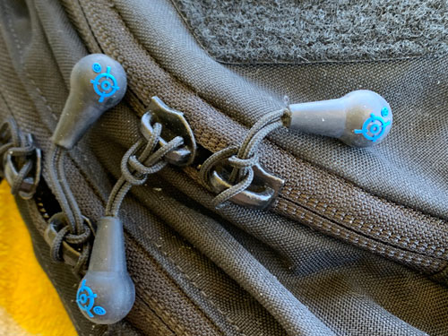
Smart marketers sell “the sizzle, not the steak.” And no Mad Men fan can forget the genius of the “It’s Toasted” tobacco ad campaign. For the BFG pack, the detail that got me was the zipper pulls. Firm little rubber balls with a cord loop extending out. Totally grippable one-handed (toddler carry) and subtly molded with a colored logo. As I write this I want to describe their size. Bigger than a pea and smaller than a grape. Then I get the “this could be a good brand” grin after I realize that a small blueberry isn’t just the right size, but includes the client’s most visible brand identifier. My writing this was interrupted as I sent them the notion in case they were looking to brand this feature as a Blueberry(™) tactical zipper pull.
As I often advise, a product can carry many brands, and each brand can help sell a feature that sells the product. Besides that, another brand is also an asset that adds to the business value in the event of a sale or IPO or other “valuation event.” And if we imagine that the feature is patented, if it becomes attractive for others to pay to license they might well want to license the trademark that helps carry the goodwill it already has already earned. Those little dangly balls might be protected in other ways, but I won’t comment on a client’s legal strategies.
The Unanswerable Questions
My favorite detail about those little zipper pulls isn’t in how the product is better. It’s how it made ME better. A little product feature actually made me smarter, which makes me happier. How? Well, I’ve always admired those who are expert at knowing how to craft the right knot for each application. I salute naval and civilian seamen who know how to keep a craft from floating away unintentionally. I admire the one-in-ten tradesman who knows how to properly secure his load at the Home Depot loading dock.
So I was excited to notice a modified larks head knot used by BFG to secure those Blueberry pulls. The rest of the world uses a larks head, but those can go loose and sloppy, and maybe even lose the pull. This one has a clever modification in which the loop is twisted to form a little eye before the ball passes through. It stays snug and secure, and demonstrates an attention to detail that reflects not just on that product but on the company’s entire product line. One product became my “coach” or “mentor” in one microscopic way I’ll keep with me for the rest of my life. Every time I use that knot I’ll have at least some subconscious gratitude to the company and product that taught me that “one little trick.”
Are the Big Boys Better?

On Message
It can be risky to publicly criticize other professionals, and it’s not very friendly to make needless sport sniping at the limitations of others’ work. Especially when one doesn’t know the complete context, and one isn’t even a paid professional at their craft. Which never stopped me before… So take this as just the observations of an outsider and see if you get any benefit. It’s the tale of two ads in the recent NRA magazine.
Incidentally, is anyone considering pulling or threatening to pull their NRA ads until the leadership fiasco is resolved? The top leadership and crony board members seem to have shamelessly circled their wagons with no apparent regard for the health of the organization, its mission, or the interests of members. I don’t fault those who must advertise, just as I must attend the show next year because of my responsibility to the health of my firm and security of my family. But if Wayne’s still around then he won’t be able to show his face among the members without getting an earful. My Zegna lapel (paid for from my own funds) may sport a sticker with a message for Wayne yet to be decided. I may print a few thousand extras and include with the preceding newsletter. Let me know if you have any message ideas as next spring approaches. Anyway…
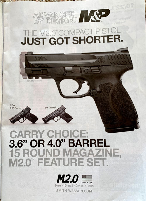
Smith and Wesson’s ad jumped out at me as good stuff. Not that it has any awesome slogans. Or anything clever enough to make me grin. Not even any technical innovations to impress a patent attorney. Same-ol’ same-ol’? But… This ad is GOOD. It’s a perfect visual for what’s otherwise a boring dimensional option. The ad makes a single point: we have a new short version of our familiar pistol. Everything about the ad supports this one point. The visual potently emphasizes this, and the dimensional text nicely disappears because every reader knows exactly what this means. What might seem a trivial difference is vividly revealed. The copy includes the key word CHOICE, which is what it’s all about. Neither size is touted as superior. Some customers want a touch more concealability and others want a touch more muzzle energy. For either type, this might be offering the perfect pistol, with an alternative that makes the decision easier by providing a contrast. Win.
My only questions are why the venerable S&W logo isn’t prominent (presumably they decided to make M&P dominant) and whether the term “Custom” might have been used to provide a high-value association and sense that one can get exactly what you need from this maker.

Not the Perfect Ad?
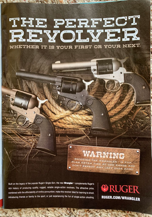
Two pages later I found a disappointing contrast from the other publicly-traded pistol maker. I’m not a cowboy pistol guy but I know Ruger is respected – these are probably great products. The headline “writes a good check” (“The Perfect Revolver”), but the ad can’t “cash it.” Not only do we never learn what makes this revolver perfect, we aren’t even sure what revolver is being sold. “Whether it is your first or your next” tries to sell to everyone and ends up reaching no one (“We service foreign and domestic”). The uncontracted “it is” in the subhead sounds like the voice of an uptight university professor, not a cowboy – phony and off key. (Notice that I almost always use contractions here because it’s the way I actually talk and you probably listen.) The Warning label has a different message: Fun. OK? So how does this relate to anything?
The fine print eventually reveals that this is a new low cost model, and uses inexpensive rimfire ammo. Good for introducing friends and family to the sport. That actually sounds like a a real benefit: Cheap and fun to shoot. How to share the gun culture (good fit for NRA mag venue). This is about grandpa taking the grand kids shooting. Shoot all day and have money left over to take the kids for ice cream (OK, so that’s not as good as “load on Sunday and shoot all week” but there might be a clever play on that for a good headline). The image is pretty, but doesn’t reinforce the message of cheap fun. Showing some rimfire cartridges wouldn’t hurt. Maybe instead of grandpa and youngster it could be a gun guy and his prospective girlfriend grinning at being introduced to an exciting new passion (or maybe sex doesn’t sell?).
The only mission this ad fills is: “We ran an ad for the new line that looks like an ad – let’s see how sales look in the months ahead.”
I’m no fan of advertising that I can’t measure the effects of. So print usually isn’t for me. My ad budget is mostly devoted to putting this very paper in your hands right now. That’s how I like to make sure my contact info is nearby you when a need arises, and it doesn’t hurt that my readers are more knowledgable and sophisticated on these important topics when the time comes to make important decisions about investing in protecting important inventions, designs, and brands.
I enjoy this somewhat one-sided monthly “conversation,” and especially the interesting feedback and stimulating replies I receive. Thanks for reading, and keep in touch! Don’t hesitate to ask me about your specific circumstances.